
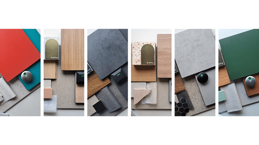
Colours and textures are powerful tools in shaping the atmosphere of sport and recreation facilities. Beyond aesthetics, they influence mood, behaviour, and the overall user experience. With the DuraSafe Compact Laminate range, architects and designers have access to a curated palette of exclusive colours and finishes, enabling the creation of spaces that are both functional and visually inspiring.
Table of Contents
ToggleUnderstanding Colour Psychology in Sport & Recreation Design
Colour is more than decoration—it’s a strategic design tool that shapes how people feel, perform, and interact within a space. In sport and recreation environments, carefully chosen tones can:
- Stimulate energy and movement
- Enhance focus and concentration
- Create calm, restorative zones
- Reinforce a cohesive design identity
The DuraSafe Compact Laminate palette, available in both Standard and Exclusive finishes, provides flexibility for specifiers to design spaces that are functional, engaging, and distinct.
Red – Energy, Passion, Action
Red stimulates excitement, raises heart rates, and encourages active engagement—ideal for gyms, training rooms, or sports courts.
- Standard Range:
- 138 Red Ochre – a muted red balancing intensity with sophistication, perfect for high-energy zones without overwhelming users.
- 138 Red Ochre – a muted red balancing intensity with sophistication, perfect for high-energy zones without overwhelming users.
- Specifier Exclusive Range:
- 204 Red Apple – a vibrant red that makes a bold statement on accent walls, locker doors, or feature panels.
- 204 Red Apple – a vibrant red that makes a bold statement on accent walls, locker doors, or feature panels.
Design Tip: Use red sparingly as an accent against neutrals to highlight circulation zones or focal areas.
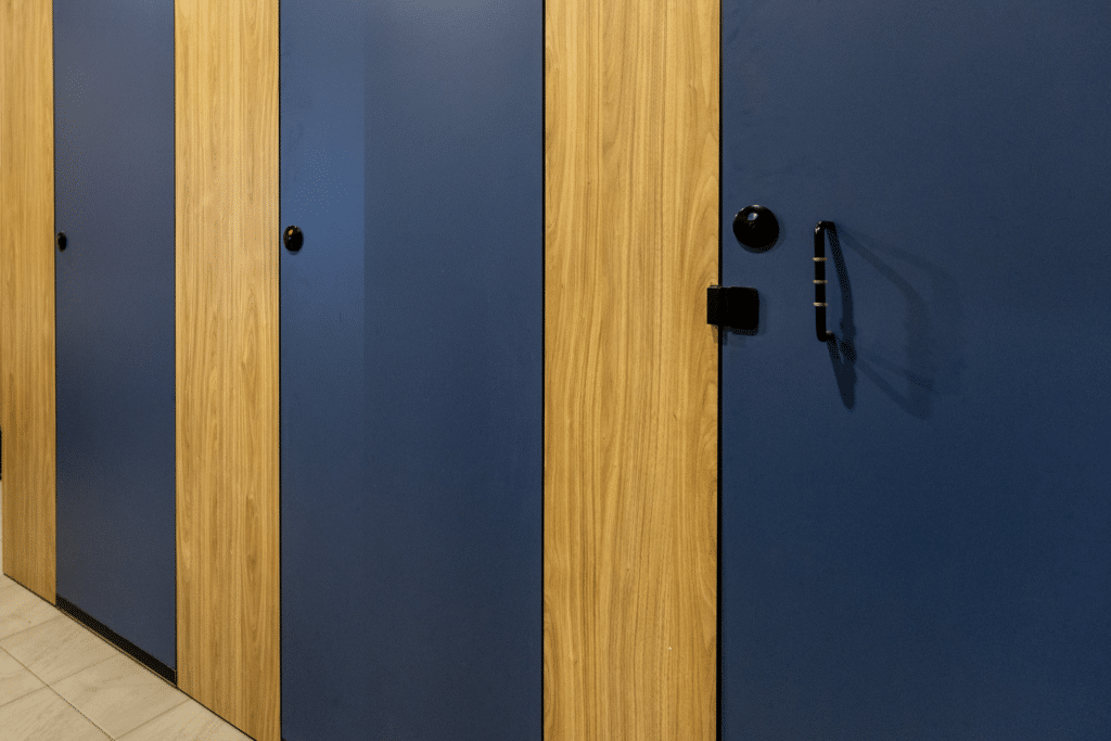
Blue – Calmness, Trust, Focus
Blue conveys serenity and supports concentration, making it a natural choice for yoga studios, meditation rooms, and wellness areas.
- Standard Range:
- 284 Sky – a light, airy blue that evokes openness and relaxation.
- 291 Royal Blue – a deeper blue offering stability and confidence.
- 284 Sky – a light, airy blue that evokes openness and relaxation.
- Specifier Exclusive Range:
- 281 Twilight Blue – a rich, sophisticated tone ideal for lockers.
- 281 Twilight Blue – a rich, sophisticated tone ideal for lockers.
Design Tip: Pair light and dark blues to create depth and subtle contrast in wellness or transition areas.
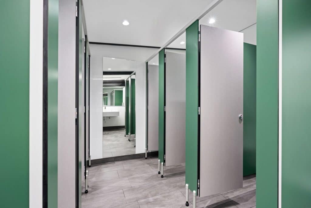
Green – Balance, Nature, Renewal
Green promotes harmony and a sense of connection to nature, making it ideal for recovery spaces, locker rooms, and wellness zones.
- Standard Range:
- 243 Sage Green – a soft, muted green suited for tranquil settings.
- 245 Gum Leaf – a deeper, earthy tone that grounds interiors.
- 243 Sage Green – a soft, muted green suited for tranquil settings.
- Specifier Exclusive Range:
- 275 Rolling Plains – a vibrant, modern green perfect for feature walls or cubicles.
- 275 Rolling Plains – a vibrant, modern green perfect for feature walls or cubicles.
Design Tip: Pair greens with woodgrain finishes or matte laminates to strengthen biophilic design principles.
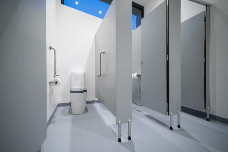
Neutrals – Versatility, Sophistication, Balance
Neutrals act as a timeless backdrop, allowing bold accents to stand out. They are particularly effective in corridors, waiting areas, and administration spaces.
- Standard Range:
- 275 Classic Grey – understated and balanced.
- 5333 Southern Pine – a warm, natural wood-inspired finish.
- 5578 Slate – a contemporary grey with depth and elegance.
- 275 Classic Grey – understated and balanced.
- Specifier Exclusive Range:
- 937 Storm Grey – a textured, modern grey.
- 134 Brown Khaki – an earthy, grounding neutral ideal for organic palettes.
- 937 Storm Grey – a textured, modern grey.
Design Tip: Layer neutrals with stronger tones to achieve multidimensional, professional interiors.
Case Study Highlights
Forster Surf Life Saving Club
Inspired by its coastal surroundings, this facility embraced 111 Arctic White and 5427 Refresh Oak. The palette captures the serenity of the beachside setting while ensuring resilience against high use. The finishes provide a bright, low-maintenance solution that enhances the sense of connection to the natural environment.
Diggers Rest Football Netball Club
Durability and identity were key drivers in this community-focused project. Neutral tone 268 Evening was applied to achieve a clean, contemporary aesthetic, resulting in spaces that can withstand the demands of a high-contact sporting environment while requiring minimal maintenance.
Pedlar Reserve Redevelopment
This redevelopment placed a strong emphasis on vibrancy and inclusivity. 279 Charcoal and 5427 Refresh Oak were combined to deliver a striking, modern backdrop, while warm undertones created balance. The result is a functional yet welcoming environment.
Conclusion
By combining colour psychology with the durability of the DuraSafe Standard and Specifier Exclusive Range, designers can create sport and recreation spaces that are energising, restorative, and inclusive.
As the case studies show, DuraSafe compact laminate range not only strengthens facility identity but also supports wellbeing and ensures long-lasting performance in high-use environments.
Explore the DuraSafe Compact Laminate range and discover how colour can transform your next project. For additional insights into our sports and recreation projects download our Sports and Recreation look book.